


10 Things: Seattle Art Fair edition, Part 1
Impressions from a whirlwind tour. And it's actually 15 things.

Seattle Art Fair is a must-see for me, if for no other reason than to check in with overall art vibes. Early on I’d make a big deal of it, attending every day and setting foot in as many SAF-adjacent shows as possible. I’m over that. FOMO? I don’t know her.
This year I met up with frequent fellow art viewer Liz Ruest and did a whirlwind tour of about 90 minutes. It was the perfect amount of time. Here’s what stood out to me.
Overall, the art was aligned with the current preference for figurative and landscape/nature-based themes. I saw some great, inspiring art. I also saw more than I expected of the could-be-in-any-art-walk-USA variety.
Last year a few galleries excited me because they showcased artists doing interesting things with materials and presentation. Those things are still neat, but some of the magic is lost when it’s a barely recycled presentation of 2023.
I continue to be fascinated by how local galleries present their artists in the art fair arena. There’s one that reliably goes so wild in the booth that I wonder what’s up with the brick-and-mortar location. A couple try to have a little of everything from everyone and it’s a mess. It’s useful to see familiar galleries work within the unifying scale and sterility that is an art fair booth.
Two favorites I didn’t get pics of: Sea of Nectars by Emily Counts, a colorful feast of glossy plexi and ceramic figures in an installation that delights my soft goth storyteller sensibilities; and pieces by Rachel Maxi at AmCE’s booth. J’adore Maxi’s art, and what I especially love in her Tetris-y, collage-y mixed media pieces is the way the frame component conforms to the shape created by the objects rather than forcing them into 90-degree corners and straight edges.
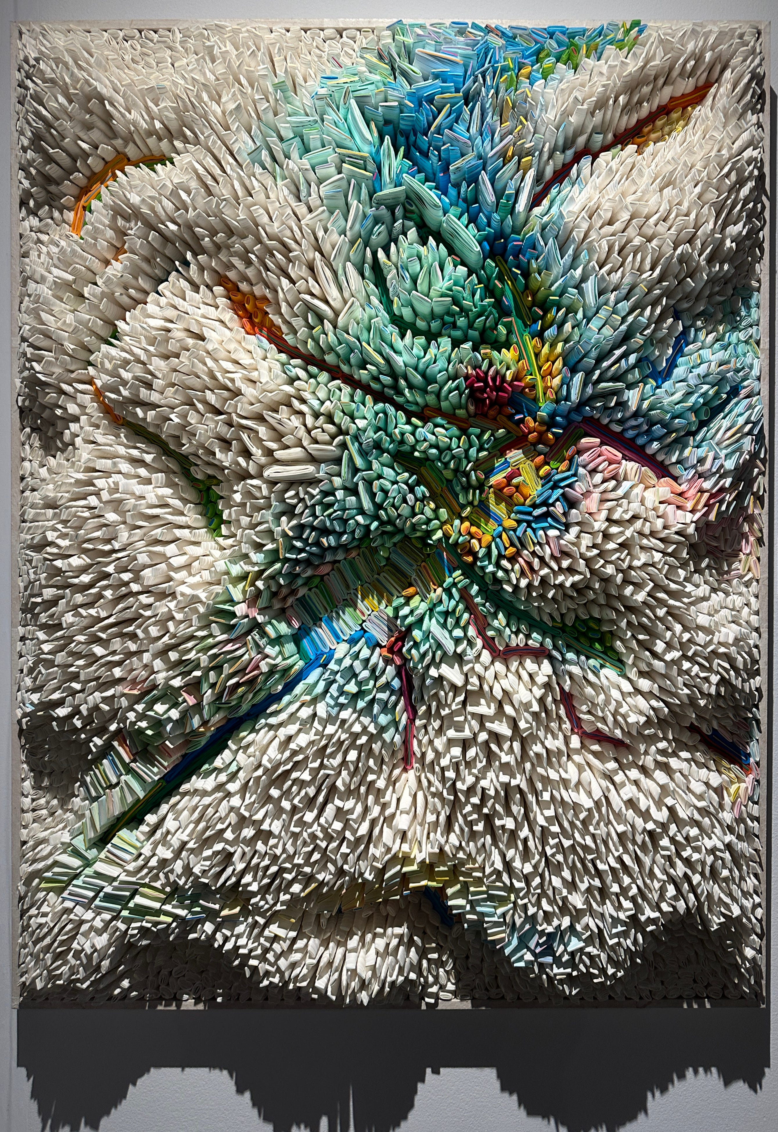
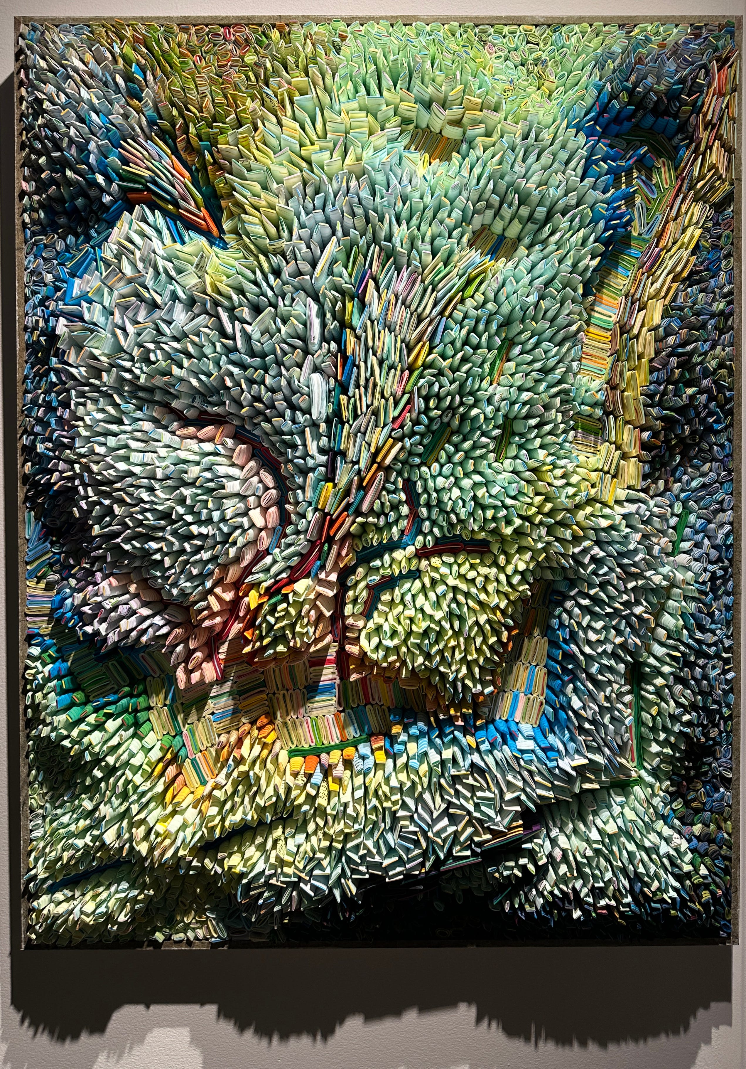
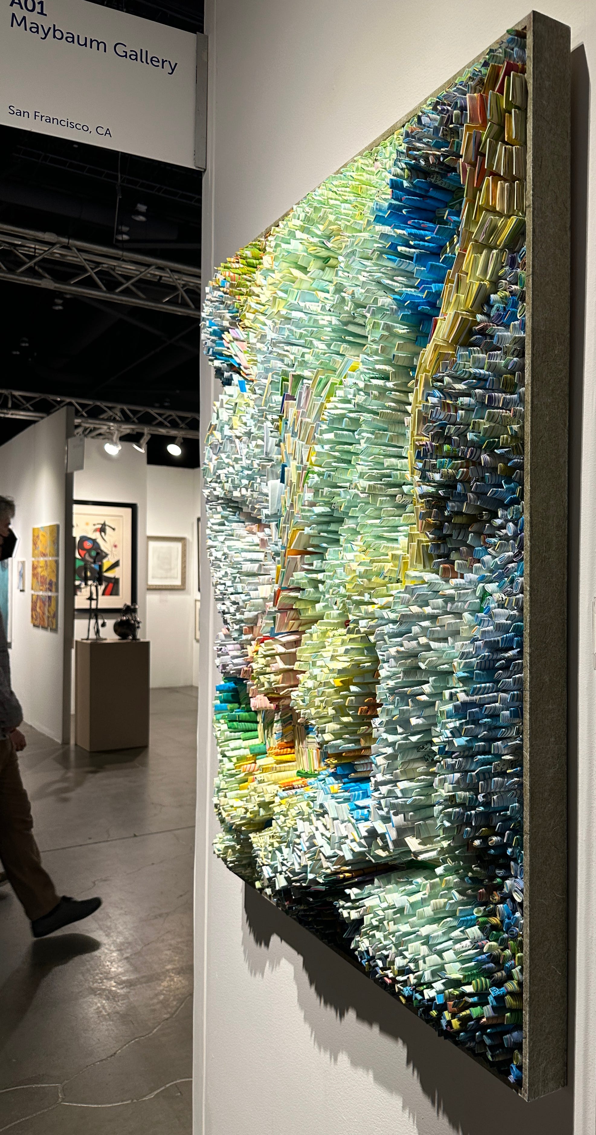
These were the first pieces I ran into that wowed me. They are made of rolled paper. It’s what quilling dreams of being in its next lifetime. So deliciously textural and excellent color restraint. Good variation in scale and depth. When you really look you notice that some of the hand-dyed mulberry paper has writing on it. They are framed, yes, but no glass. The artist is Ilhwa Kim (on Instagram @ilhwa.k), represented at SAF by Maybaum Gallery.
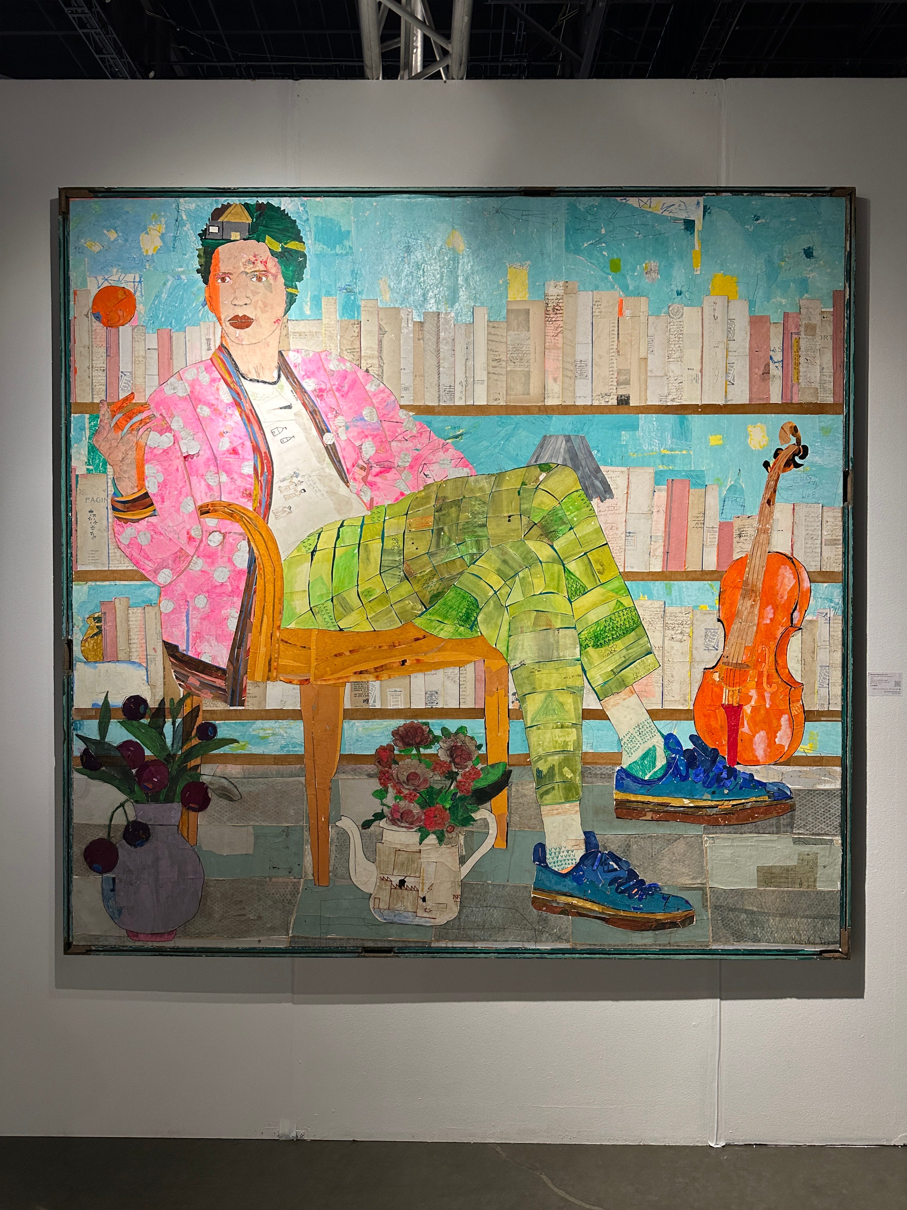
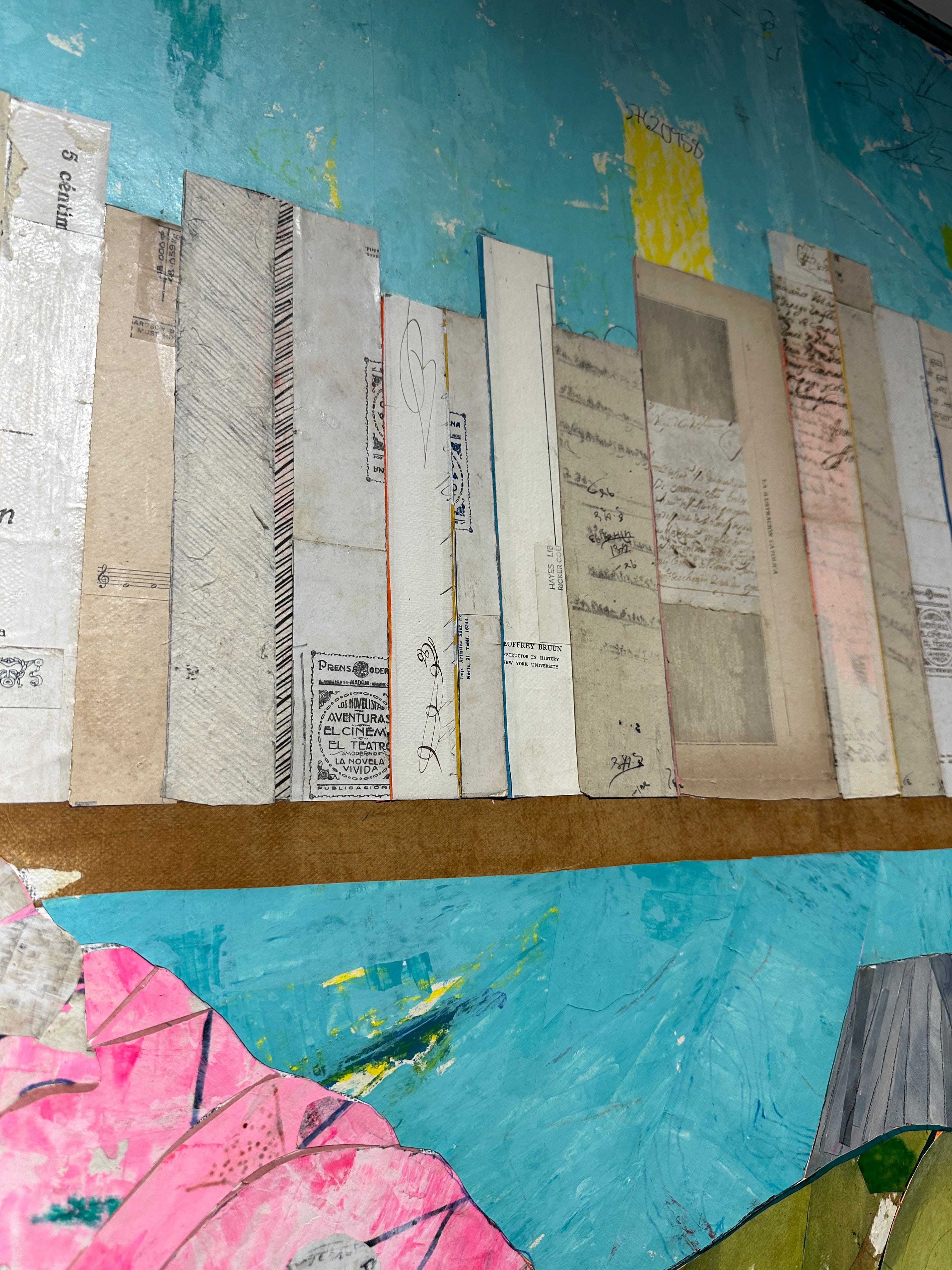
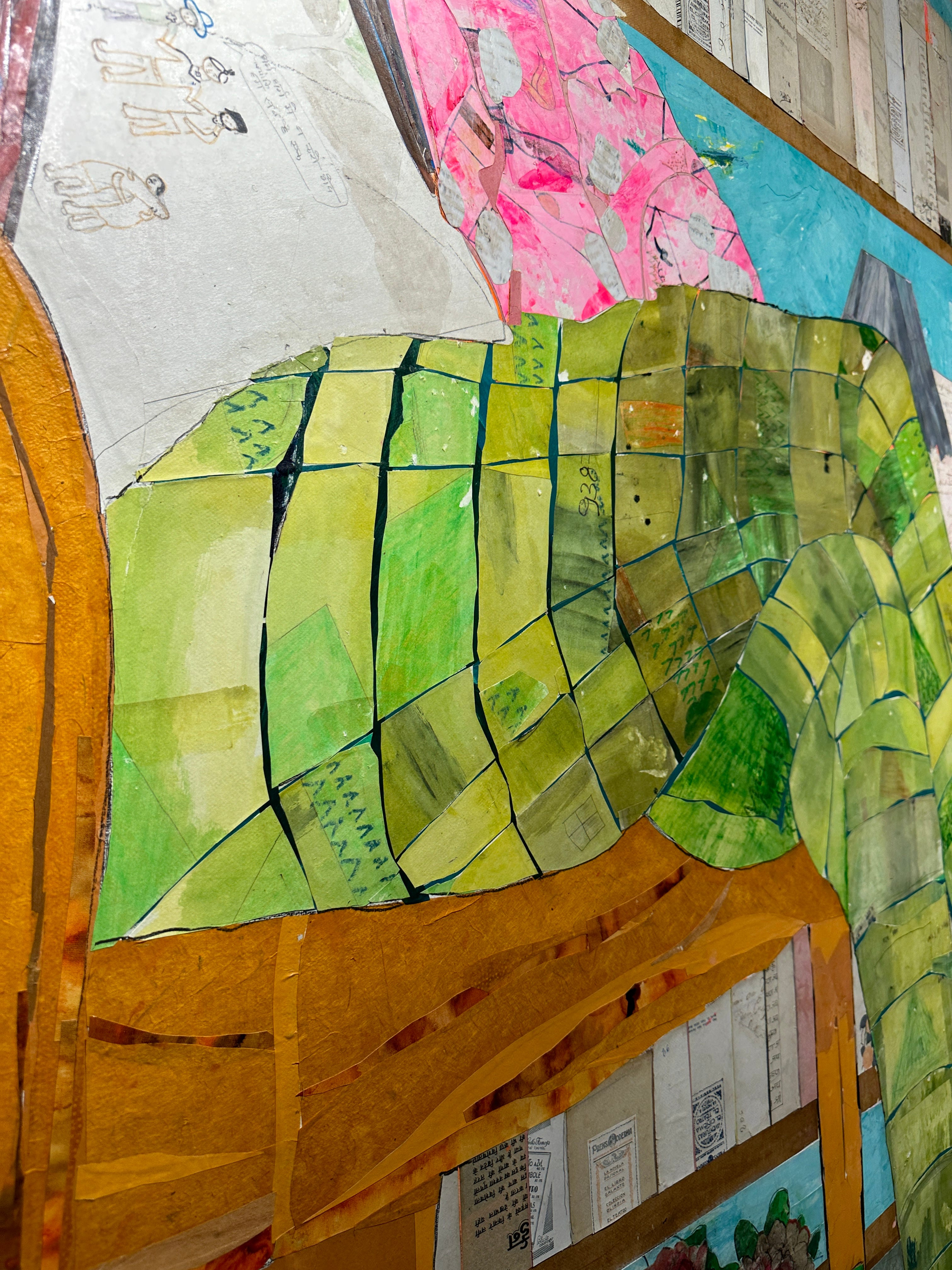
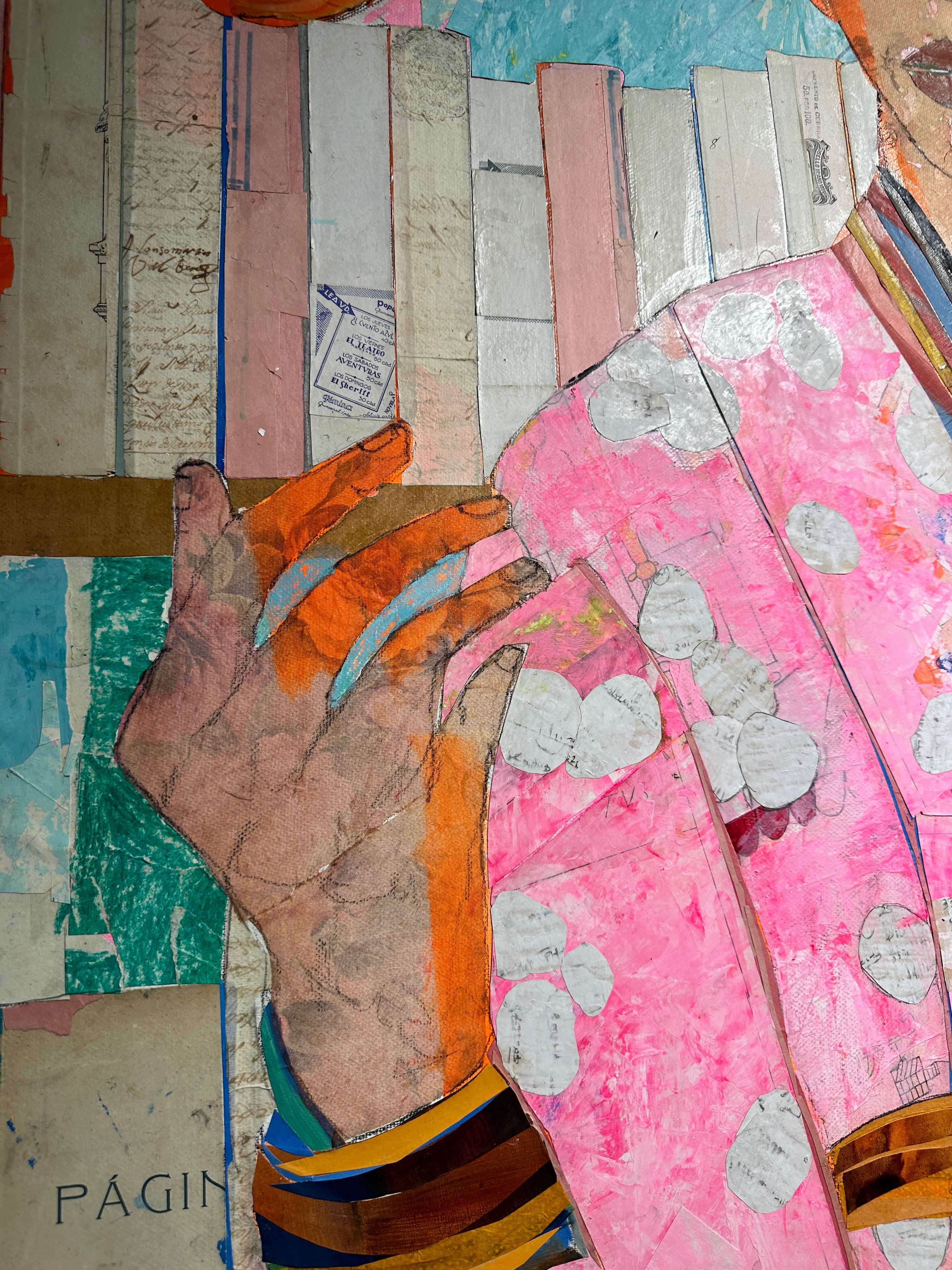
I’ve been a fan of Mersuka Dopazo since I first saw her large-scale work, maybe in 2016? Kudos to Rebecca Hossack Art Gallery for transporting art of this size every year. What thrills me about Dopazo’s work is that it speaks so powerfully both from across the room and up close. There are details for days and days, something too-often eroded in our more online experience of art. Dopazo snaps your attention into place and has the receipts to back it up. Her style is scrappy and patchwork with clean lines and brilliant use of color. This piece is the most collage-like of what I’ve seen so far. The ball in the air and the way the orange connects to the fingers below it and the side of the figure’s face while leaping across to the violin waiting to be played…hell to the yes.

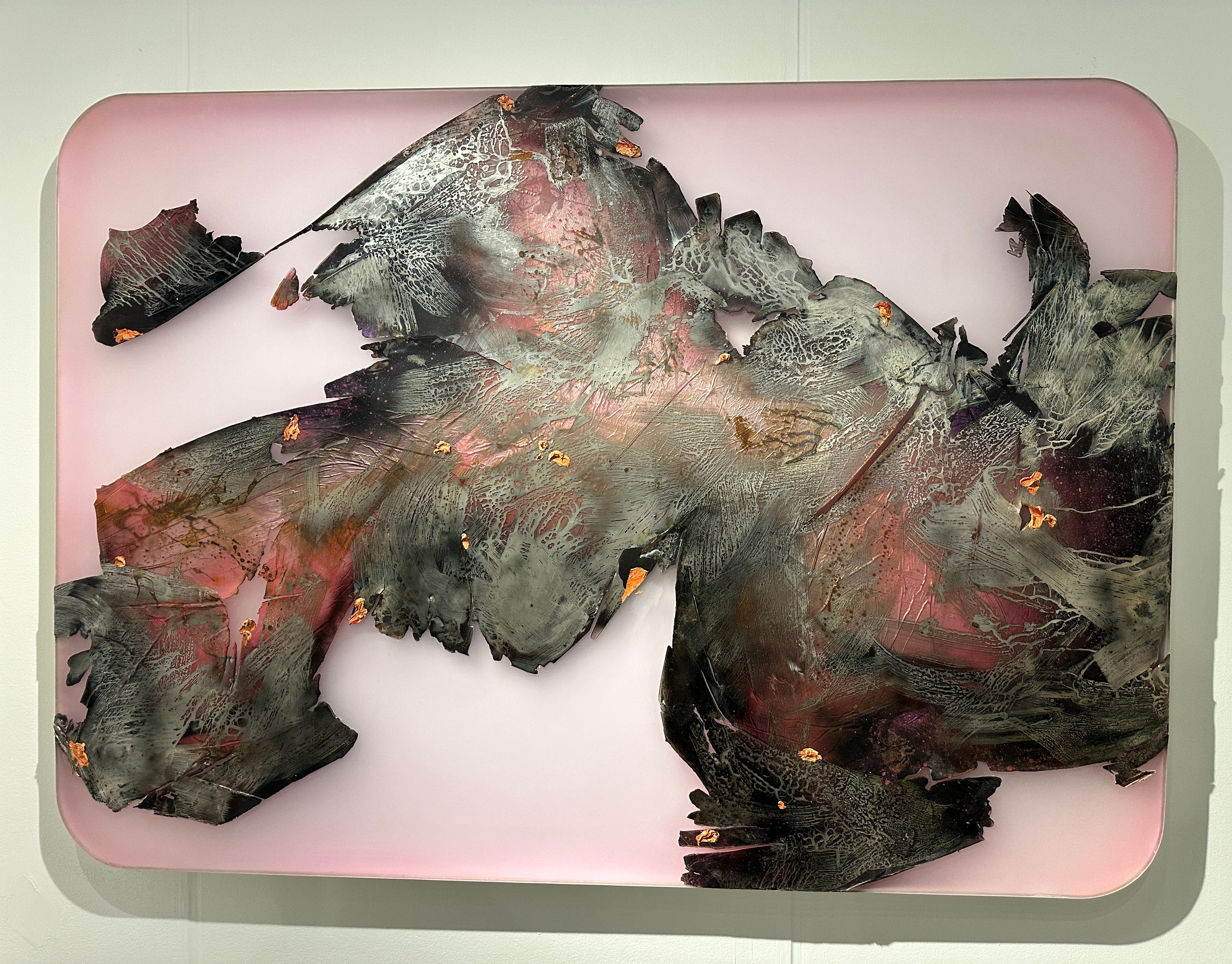
This piece is so good and so unexpected. I popped into Winston Wächter’s booth to get a closer look at Susan Dory’s paintings which I always want to lick and there was Peter Gronquist’s work. It has the appeal of those acrylic skins or the artifacts you sometimes get when monoprinting, but at a really sexy, impossible scale. And the plexi background with its soft pink gradient and rounded corners is a delectable support for the complex chemistry of the foreground. I lurv it. What doesn’t come across in the photo is how it isn’t a flat piece. There are edges that appear to be peeling up and curling, and then there are the luscious dollops of oil paint. Probably my favorite piece of the whole fair.
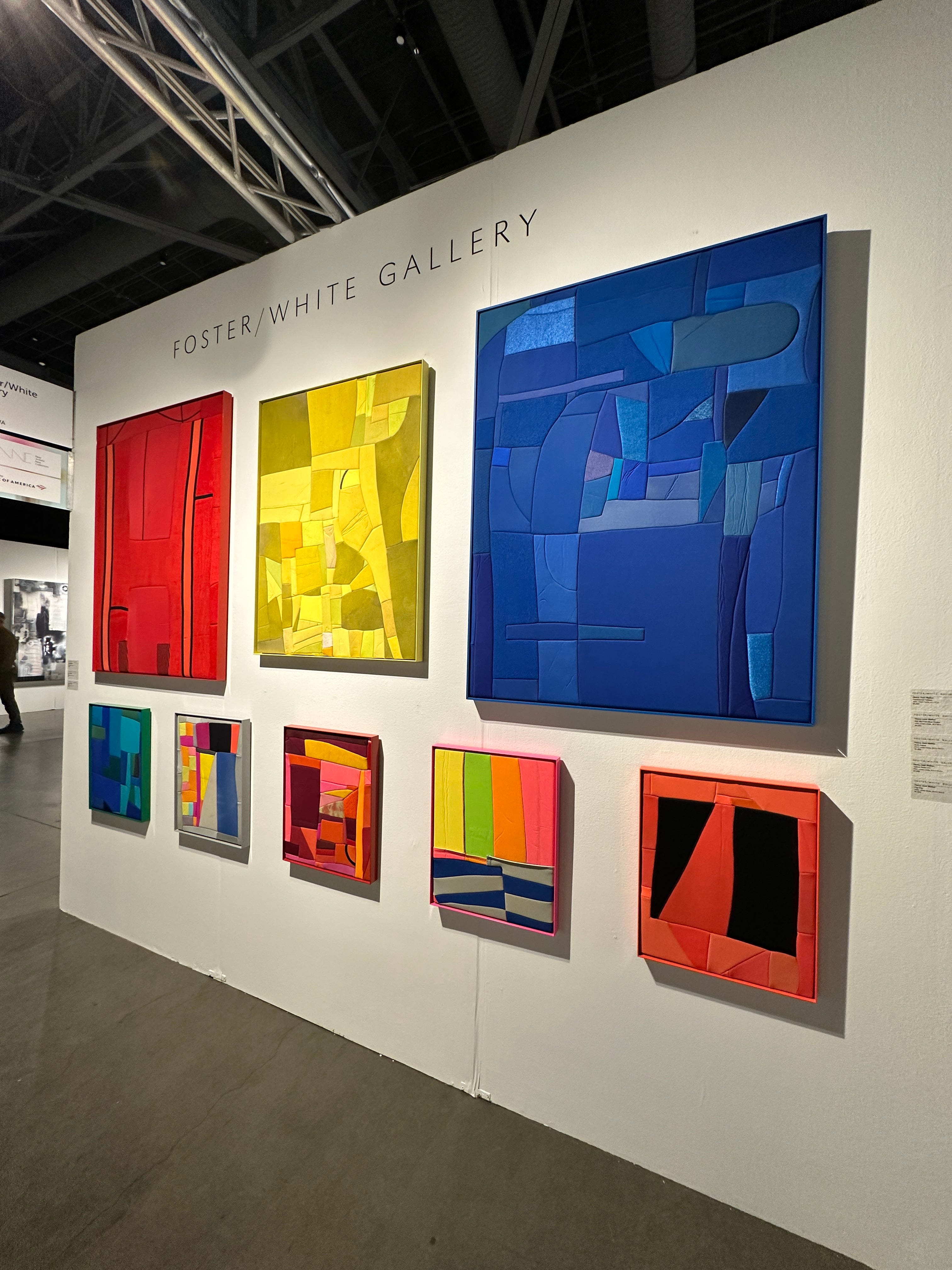
Honestly, when I saw this wall of Henry Jock Walker’s work at SAF, I was surprised it was at Foster/White and not Greg Kucera Gallery. The pieces are sewn collages of found neoprene. I like the cellular structure without the conformance to a grid pattern. I like the variations in the collection and differing sheens. I like the powder coated frames. I like how the most dramatic pieces are smaller scale because they don’t have to be big to pack the same punch.
Hang tight, friends. Part 2 is coming soon.

.